Salv Bridge collaborative investigations UI redesign
B2B SaaS
Product research
UX design
UI design
Team
Product: Ester Eggert, Head of Product
Engineering: Rando Kulla, Engineering Lead; Risto Pärnapuu, Product Engineer, Jürgen Lorenz, Product Engineer
Background and problem statement
Salv Bridge is a product intended to foster collaboration between financial institutions to combat financial crime. We started out by building a secure platform tailored specifically for FinCrime teams to enable instant messaging between each other, and then iterated to facilitate structured data exchange and central entity reporting and querying. The product met initial success, as it had been adopted with nearly 100% market coverage in Estonia, as well as in one other CEE market, while also gaining momentum in the UK.
However, as it is a network-based product in an highly regulated field, scaling it often faces the cold start problem. There's a range of data- and information-sharing products on the market catering for a variety of FinCrime use cases (from sharing potential risk flags to facilitating fraudulent funds recalling between institutions). For us to be successful, we needed to be clear how we position the product.
Looking back at the use cases that made us successful in Estonia, we realised it's not about "data sharing" per se. Rather, our product is used as an inter-bank intelligence-sharing tool to assist in collaborative investigations – acting as a channel for FinCrime teams to send timely signals to each other about potential criminal cases before they have been confirmed, and then work together to confirm them.
Talking with stakeholders in many European Tier 1 banks and global Fintechs, we quickly realised that this positioning resonated well – this is what's needed on the market. However, what we noticed while validating our product was that, as soon as we showed them the product UI, our narrative was not working well anymore. The UI, although functionally performing fairly well in the markets where the product is live, gave the impression of a "secure email inbox" – it did not feel like the shiny new tool it was supposed to be – although it was already functioning well in the markets we were already live. This resulted in potential prospects immediately categorising us against products we did not intend to compete against (e.g. SWIFT messaging system, Signal, or even a plain e-mail).
Moreover, as the product had evolved over time, the UI had become limiting in facilitating some new features (for example, proper case filtering). We therefore made a strategic decision to invest into redesigning the product interface.
Project goals
Redesign the UI to support the product positioning as a "collaborative FinCrime investigations tool"
Facilitate improved case management features
More intuitive investigation filtering and search
Better investigation status/property visibility
Review and revisit product terminology where needed
Research and analysis
At Salv, we run regular side-by-sides and community workshops with our users and therefore know their workflows and problems fairly thoroughly, so I felt confident kicking off the analysis and design work of this project without any extra discovery sessions with the users.
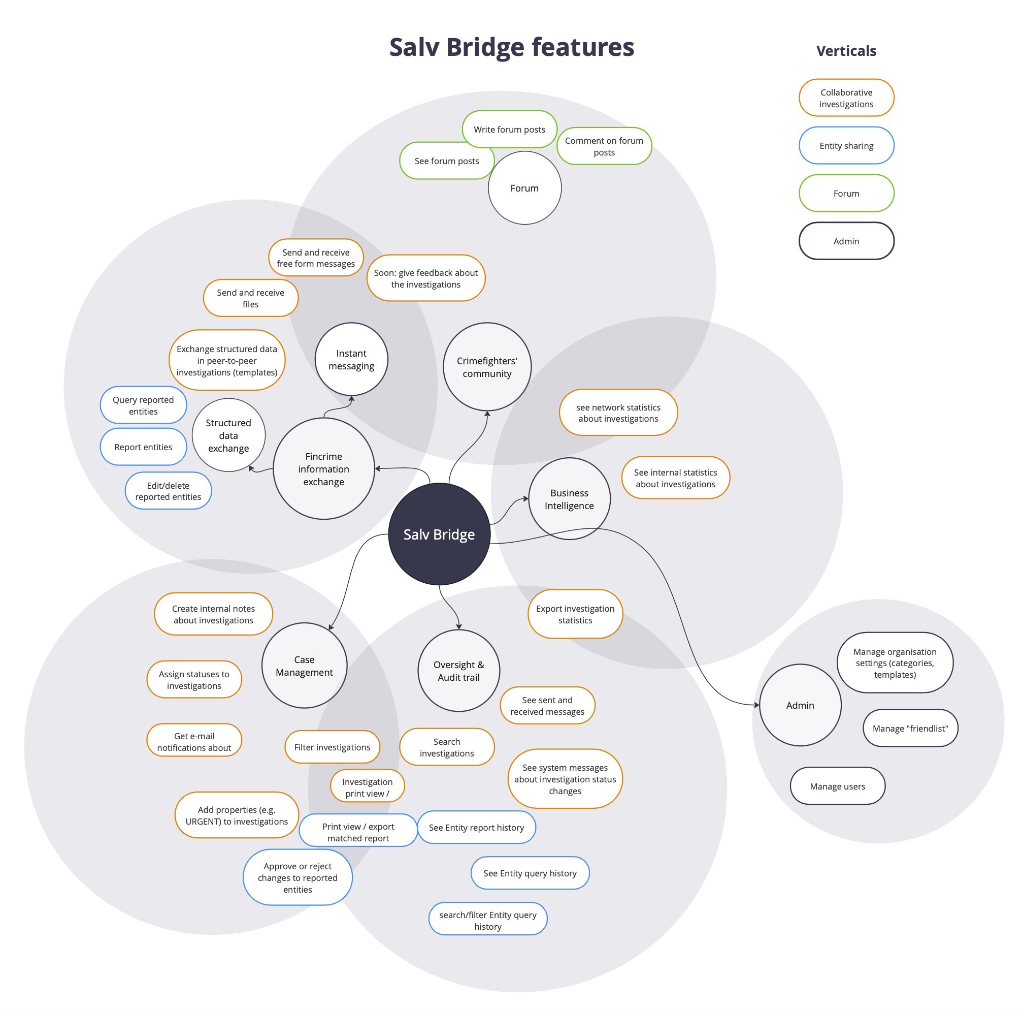
As this was intended to be a major rework, I wanted to make sure we are clear about the scope (and also that during the process, we do not lose anything crucial). So I started out with mapping all existing product features (which also helped to facilitate in-house discussions around the positioning). Everything marked with orange border was due for a redesign.
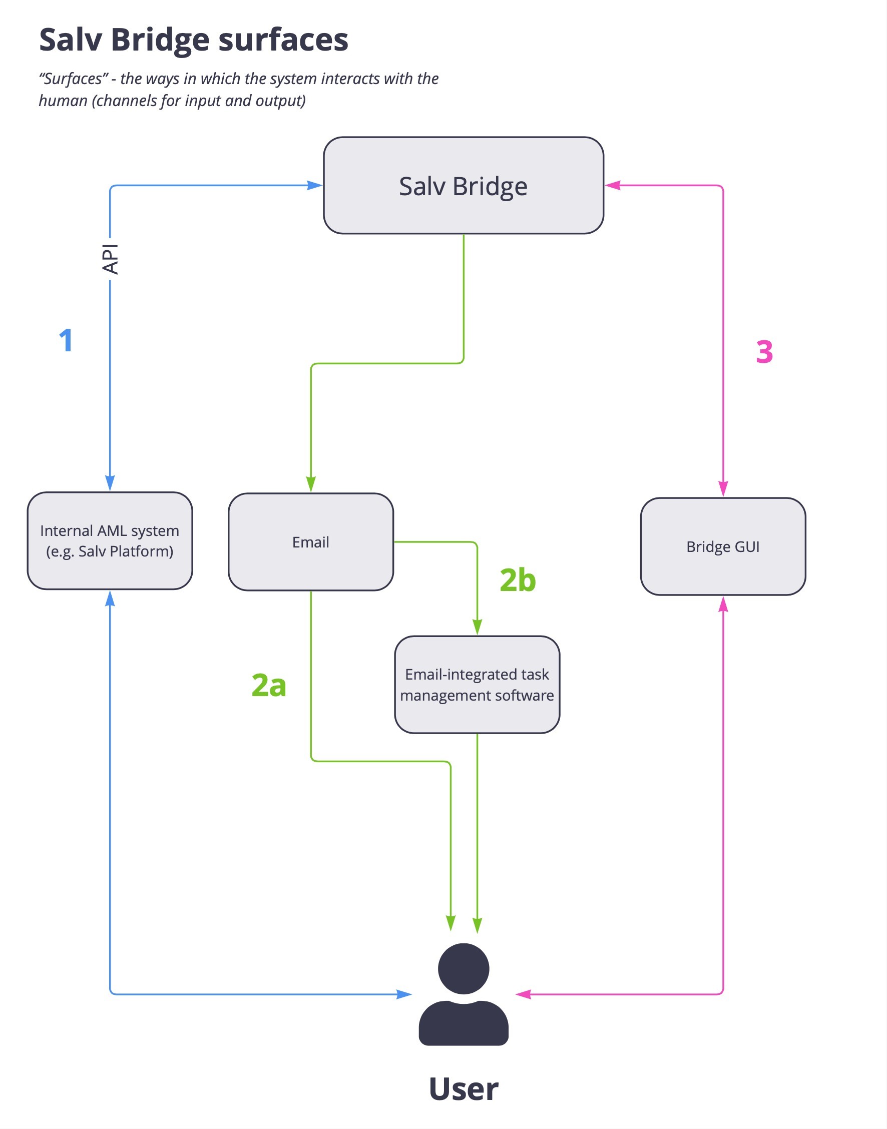
When it comes to surfaces through which the users interact with the product, there are 3 option:
Salv Bridge is integrated directly into some AML tool via API. Users interact with Bridge using the AML system's UI.
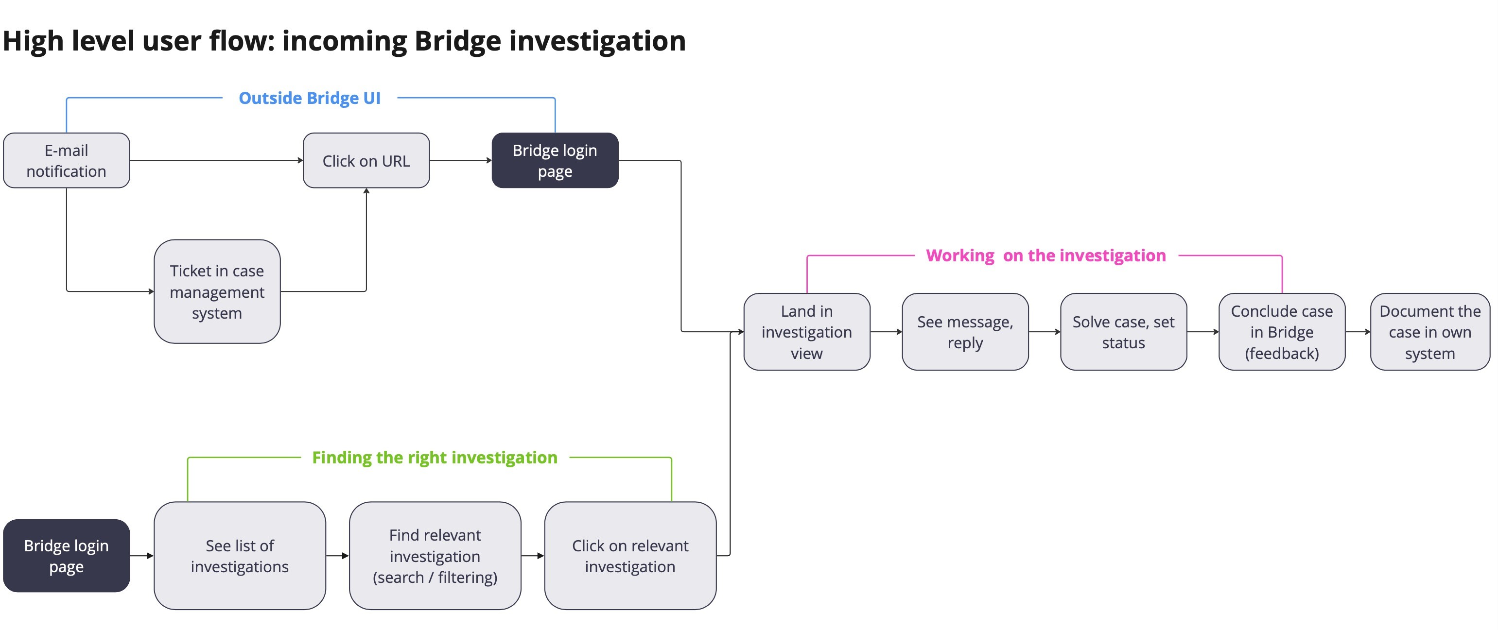
In the case of incoming investigations, Bridge pushes out e-mail notifications. These emails reach the user either directly or via some task management / ticketing system integrated with their email (e.g. Zendesk). Users then follow the link in the notification that leads them to Bridge graphical user interface to deal with the case.
Users interact with the product directly using Bridge GUI – either to start a new investigation or find and deal with an incoming one.
As in the first flow the users do not interact with the GUI, this redesign was only concerned with flows 2 and 3.
When mapping out the more detailed user flows for incoming Bridge investigation requests, the limitations of the current UI became evident.
There are 2 primary flows. Users enter the product UI either by following an URL from an e-mail, in which case they land directly at the correct investigations view, or they log in and find the right case by searching, filtering or clicking through the list of investigations.
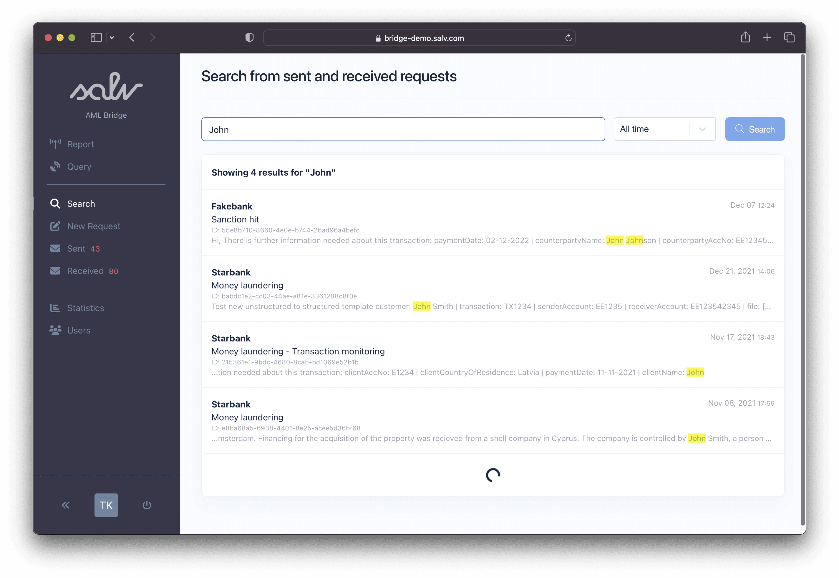
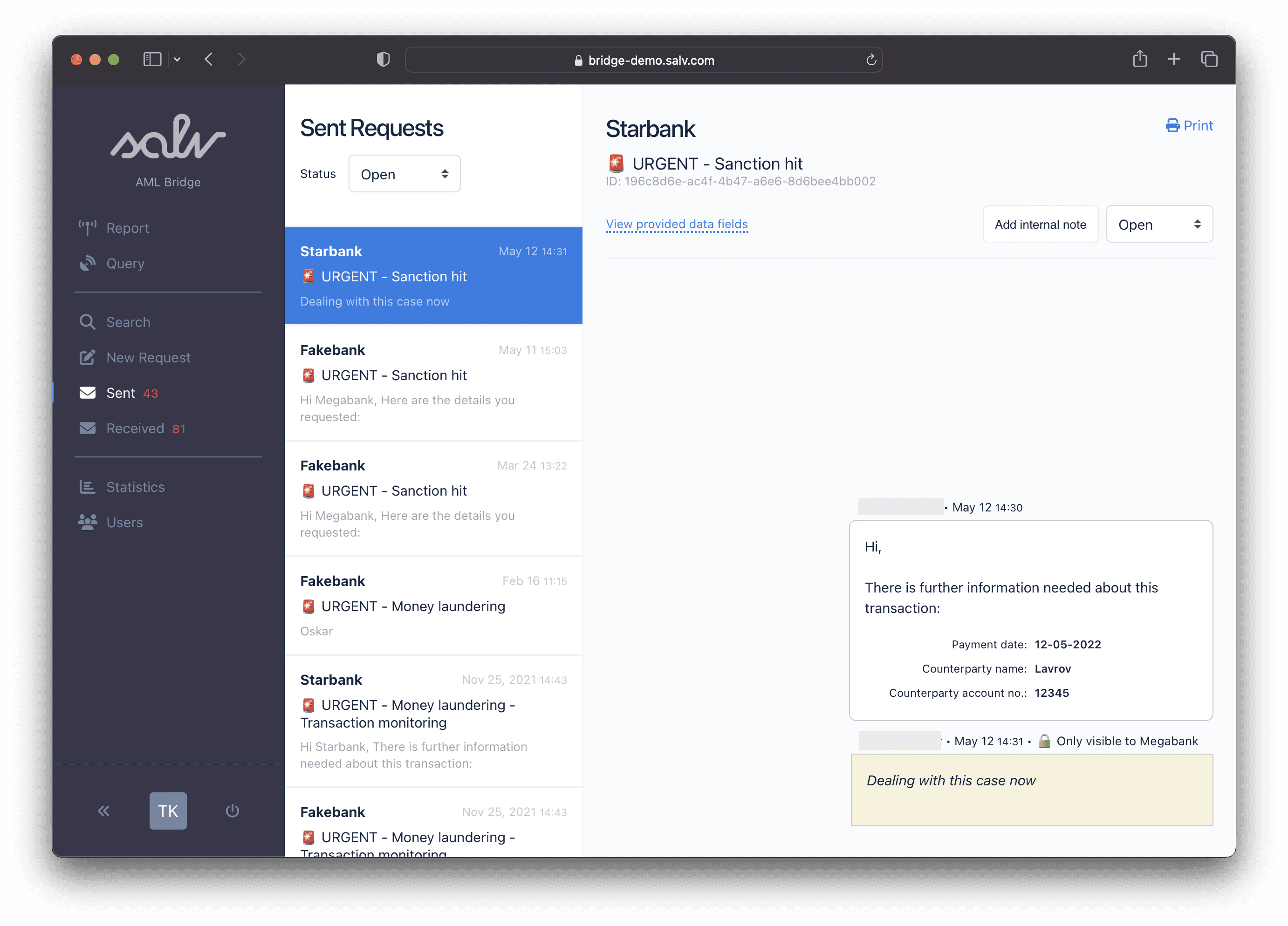
The existing UI was not well optimised for neither of those flows. Finding a specific investigation either meant navigating through a crowded list, or searching via a separate menu item detached from the actual investigations list. The UI provided some basic filtering capabilities, but the narrow strip did not really facilitate expanding the filtering features to meet user needs.
On the other hand, if the user arrived from an e-mail notification and landed directly on the correct investigation, almost 40% of the real estate on the screen would be spent on non-required functionalities (seeing the list of other irrelevant investigations).
In addition, the interface had a number of other issues:
Conversation header took way too much space
No space for expanding filtering capabilities
Navigation menu was bloated
It could not very well facilitate investigation properties (e.g. "tags") concept we had recently implemented
It was just a bit outdated – our design system had evolved by then
Design
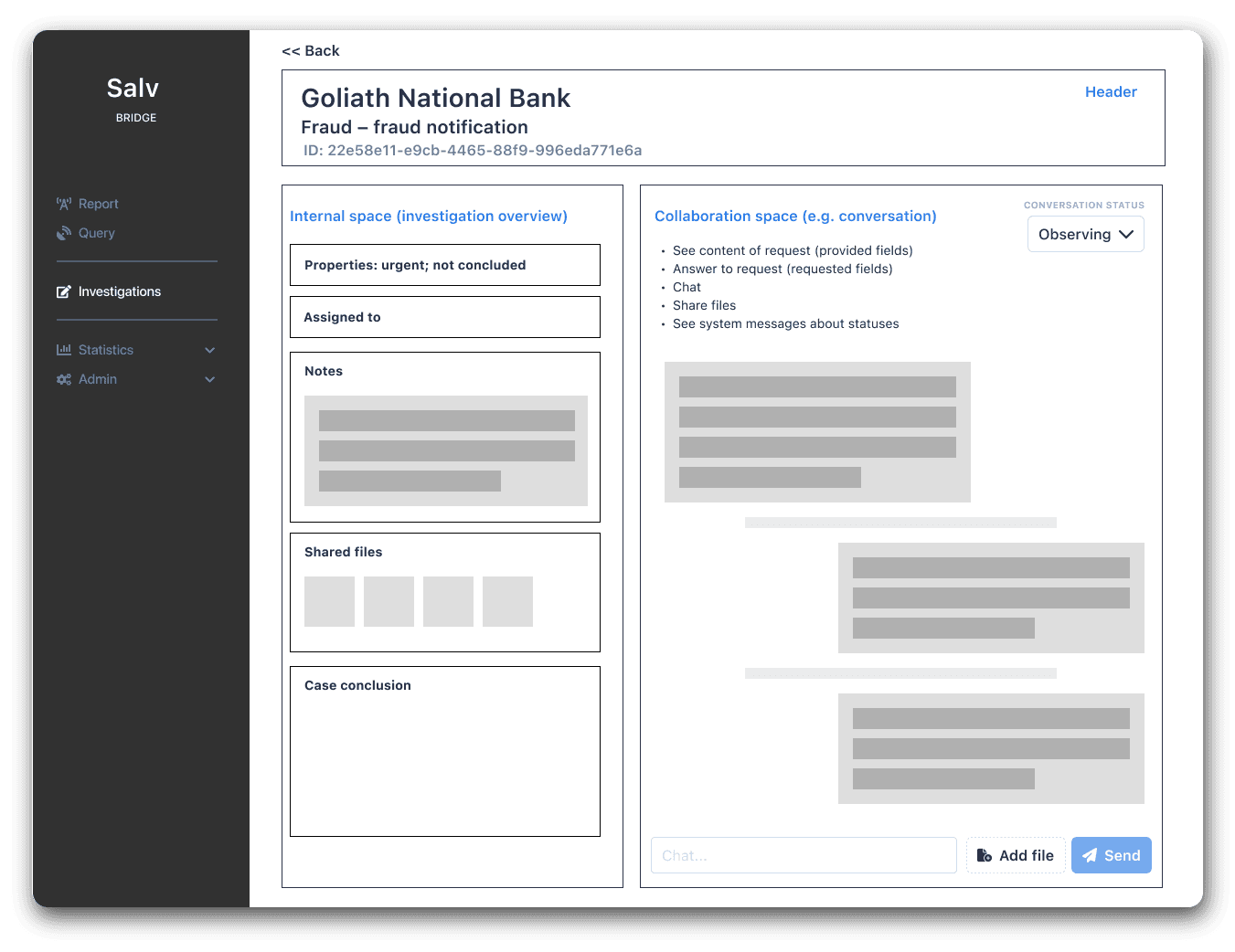
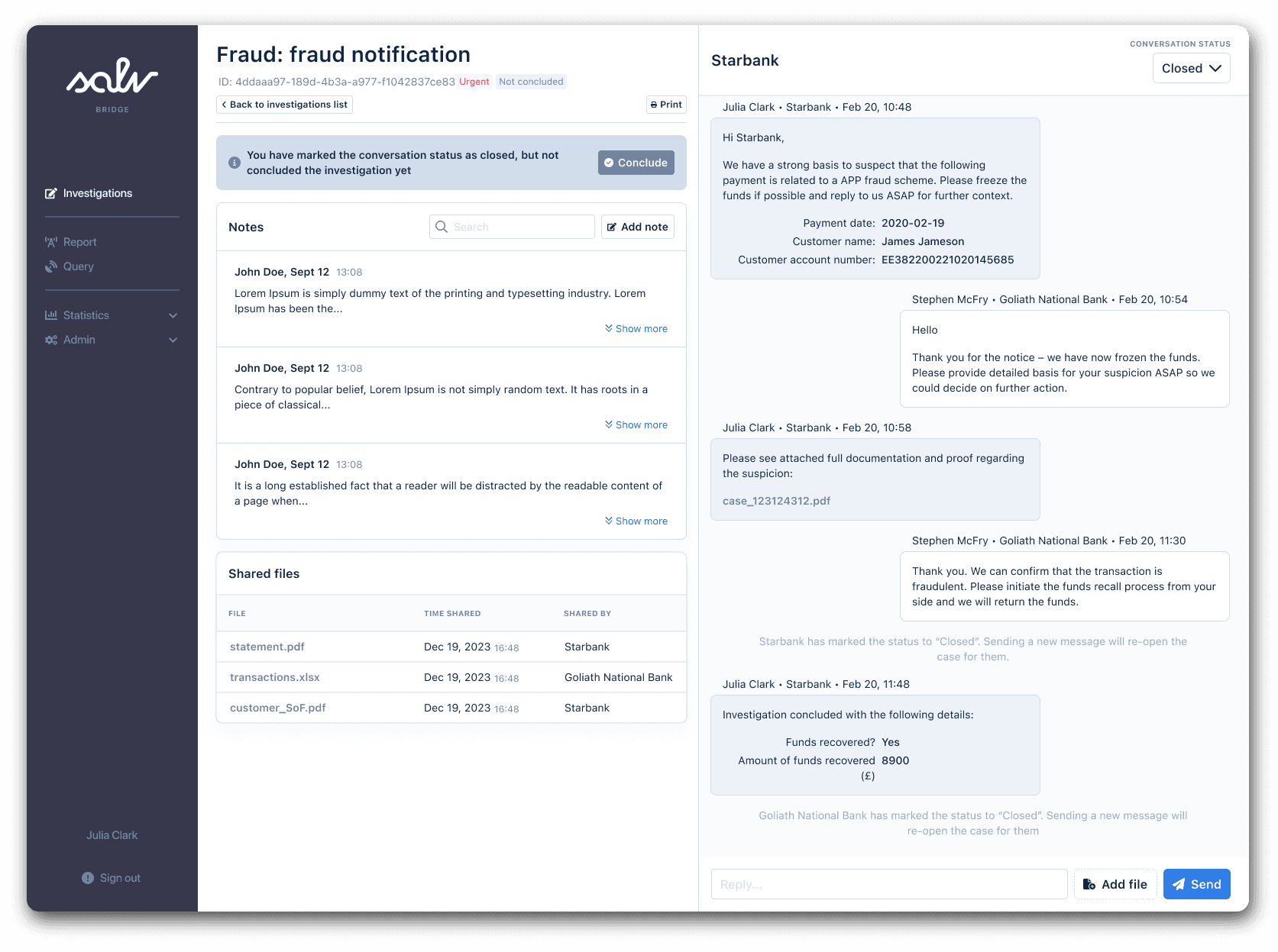
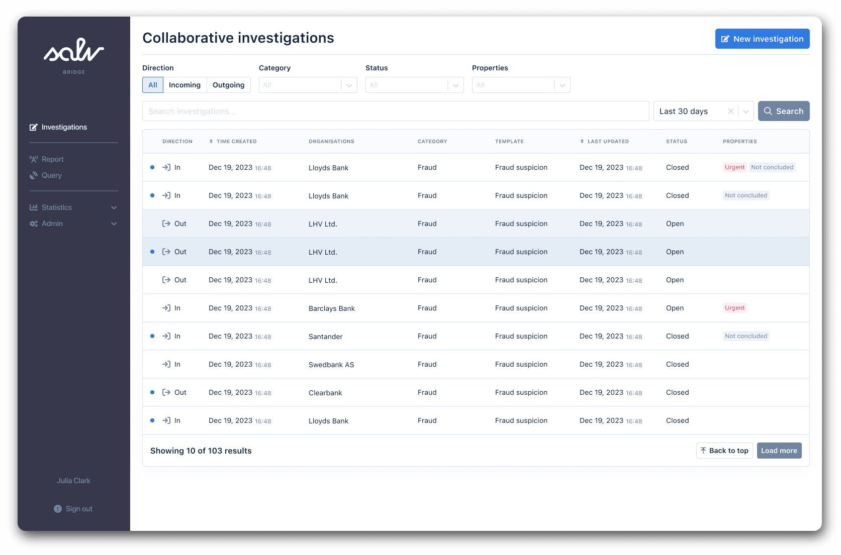
Given the analysis described above, one of the premises of the new design was to separate the investigations overview from the investigation detail view – and design both views to be more functional for their intended purposes.
Also, as the product now had a new vertical that did not exist before (Entity Sharing), I wanted to simplify the overall information hierarchy and clean up the side navigation, bringing everything related to "collaborative investigations" under one menu item.
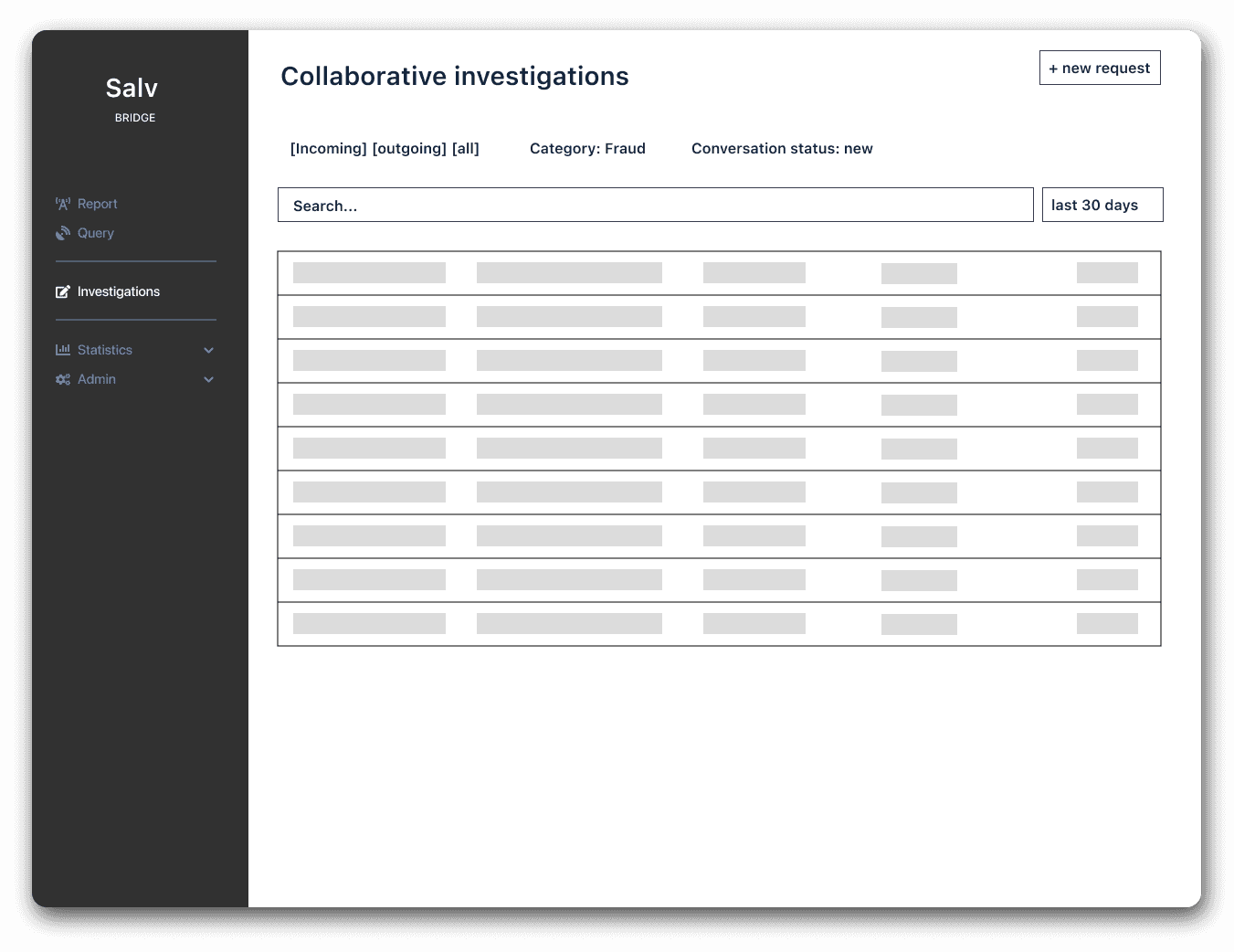
Incoming and outgoing investigations, formerly under separate menu items, would now just be separated by a filter, giving the users an opportunity to get a full overview of all ongoing investigations. Search bar would be placed in the same view for an un-disturbed experience.
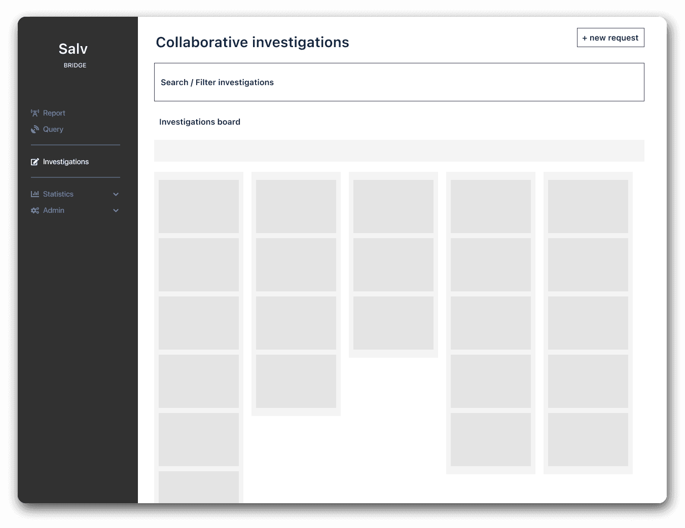
Two conceptual approaches were considered – a Kanban style board view, and a usual filterable data table. However, considering the volumes and filtering requirements, it became evident fairly quickly that the table view is superior in this case, so I abandoned the Kanban approach.
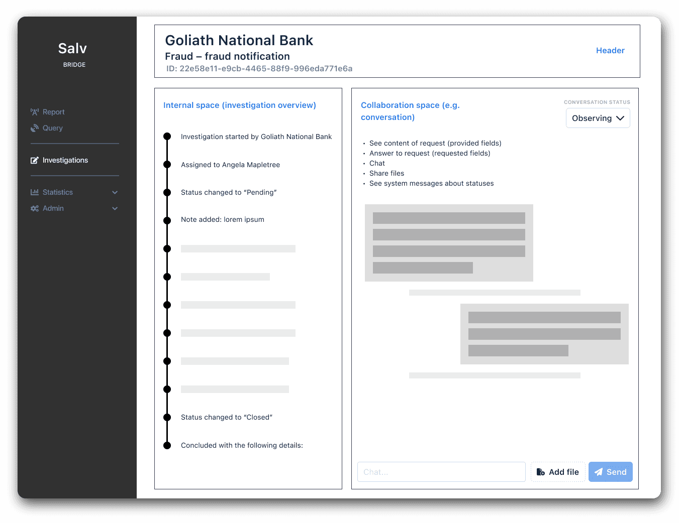
For the investigation detail view, I took the approach to split the view into two main sections: an "internal space" for everything that is specific to the user's own organisations, and a "collaboration space", where the conversation happens. The underlying idea here was that – as the information shared (but also internal notes) can be sensitive – there should be absolute spatial clarity about which information is shared with other institutions and which isn't – hence the distinction between the "internal" and "collaborative" spaces.
As every investigation follows a certain lifecycle, I experimented with the idea of a "timeline" – where any action taken on the investigation (be it a new note, status change, file addition etc) would be placed on a timeline. This would give an instant overview of what has been happening with the investigation.
However, looking at the actual usage patterns, I realised that the notes users write inside the investigations can be quite long and the timeline format does not facilitate this very well. Also, most of the events recorded on the timeline would be somewhat duplicated in the conversation window anyway (thinking about it, a conversation flow can be seen as a kind of timeline itself). I therefore went with a more basic approach of just having dedicated content blocks in the "internal space".
Validation
For design validation, I presented high-fidelity prototypes to 3 of our core customers' fraud operations teams: Swedbank, SEB, LHV. The main aims were to get user impressions on the core design changes:
Separation of investigations list and detail view
Separation of "collaborative space" and "internal space" om the investigation detail view
including bringing notes out of the conversation window
Bringing the whole feature set under one menu item
In general, the reception was good. Users welcomed a better overview of the investigations list and expanded filtering and search capabilities. In addition, a few other opportunities were identified:
Highlighting investigations with unread messages in the list view
Would like to make sure that investigations can be searched based on their ID and also the content of the notes
Would like to specify a custom time window for search
These requests were left out of the initial scope, but went into the product backlog.
Results and impact
The final design is shown below. The UI is mostly composed of previously existing components from Salv Design System. Updating these components was not part of the project scope – hence why one might notice slight discrepancies or conflicts in visual hierarchy or the level of polishment.
At the time of writing, the new version has been live for customers for a couple of weeks. Initial feedback has been positive – users welcomed extended filtering capabilities and a more holistic overview of investigations and their status.
Also, the (voluntary) investigation conclusion rate went up by about 30% – possibly thanks to making the investigation properties (including "not concluded" tag) more visible.
Next steps
As an actionable feedback, some users mentioned that they miss the content preview and highlighting functionality when searching, which was present in the previous view, but did not fit well with the table concept.
Another request was to have the opportunity to set a custom date range for search (due to encryption technology searching over all time takes a lot of time, so it makes sense to narrow the search window down if possible).
Note: As of July 2024, I no longer work at Salv, so I did not have the opportunity to conduct a thorough follow-up research about the results and impact of this development. Nor do I know whether the interface change fulfilled the initial purpose of resonating well with the leads in the new market. When I left, Salv Bridge was somewhat in the search for its product-market-fit – at least in the larger markets.
© Taavet Kutsar 2024. All rights reserved.
